Introduction
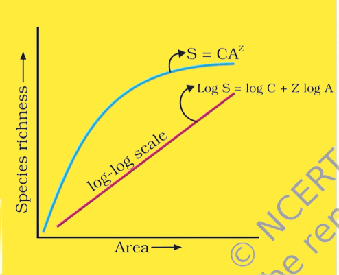
Get ready, fellow students, because the species-area relationship is an absolutely fascinating concept in ecology! Let’s dive into this captivating topic together. This relationship was introduced by the eminent scientist Alexander Von Humboldt, who embarked on an adventurous journey exploring the wondrous South American jungles.
Now, what’s the deal with this species area relationship? Well, it helps us unravel the intriguing connection between the size of an area and the number of species it holds, known as “species richness.” In other words, species richness refers to the presence of different kinds of species in a specific area.
Hold on, there’s a cool twist to it! Species richness isn’t concerned with the abundance or sizes of populations within each species. Instead, it focuses solely on the number of unique species dwelling in that area. It’s like counting the different flavors of ice cream in a massive ice cream parlor – the more flavors, the higher the species richness!
Understanding the meaning of species richness in relation to the species-area-relationship is of utmost importance. So, let’s embark on an exciting journey to explore this ecological wonder! Feel free to ask questions, share your thoughts, and let’s discover the magic of species diversity together!
Meaning of Species-Area Relationship
Alright, students, get ready for a hands-on approach to grasp the species-area relationship concept! Let’s step into a practical example together – picture yourself taking a delightful walk in a nearby park. As you stroll along, you’ll notice various kinds of plants, animals, and other fascinating organisms. Now, hold that thought!
Next, let’s up the adventure level! Imagine you decide to explore a magnificent forest. In this lush forest, get ready to encounter an even more diverse array of species. Cool, right?
So, here’s the deal: as the area increases, the species richness also increases accordingly. In simpler terms, the larger the area, the more diverse species you’re likely to find. But hold on, there’s a catch! There comes a point where this relationship reaches its limit. It’s like a game where you keep collecting species as you explore, but eventually, you’ll reach a point where adding more area won’t significantly increase the number of species.
Think of it like exploring a treasure-filled world. At first, the more ground you cover, the more treasures you find. But eventually, you’ll discover most of the treasures, and covering additional ground won’t lead to many new discoveries.
Isn’t this an exciting concept? So, let’s embark on this learning journey together! Feel free to ask questions, share your thoughts, and let’s unravel the mysteries of the species-area relationship. Remember, there’s no limit to what we can explore and learn!
Species-Area Relationship Curve
Alright, fellow students, let’s dive into the captivating world of the species area relationship by taking a closer look at the species area graph. This graph is the key to unlocking the secrets of species richness!
Imagine the graph right in front of you: the X-axis represents the area, and the Y-axis represents the number of species present. As we start at the left, the graph shows a gentle slope, indicating that as the area increases, there’s a proportional increase in the number of species, which we call species richness. It’s like finding more and more treasures as you explore a vast land – the bigger the area, the more species you’ll stumble upon!
But, hold on tight! As the area continues to grow larger, something fascinating happens. The graph reaches a point where the curve levels off. This means that further increasing the area won’t have any significant impact on the number of species found. It’s like reaching the point where you’ve uncovered most of the hidden gems, and covering more ground won’t lead to many new discoveries.
And guess what? The overall impression of this graph is described as a rectangular hyperbola – a fancy term, but it simply means it takes that cool shape resembling a rectangular curve!
So, isn’t this an exciting way to understand the species area relationship? Let’s keep our scientific explorer hats on and delve deeper into the mysteries of ecological patterns! Feel free to ask questions, share your thoughts, and let’s make this learning adventure unforgettable!
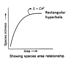
The species-area relationship graph
The mathematical representation of the relationship between the number of species (s) and the size of an area (A) is as follows:

When we take log on both sides, the equation becomes like:
log S = log C + Z log A
S – species richness
A — area sampled
C — It is a constant and represents the Y-intercept
Z — It is a constant and represents the slope of the line (regression coefficient)
When we take the logarithm (log) of both sides of the equation, it helps transform the relationship into a straight line on a graph. The logarithmic form is generally used to simplify the data, allowing for a clear representation of the relationship between species and area.
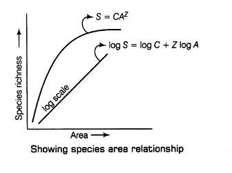
To truly grasp the graph, it’s crucial for us, as curious students, to dive into the meaning of the factors present in the equation, particularly those mysterious constants C and Z. Let’s start our adventure by unraveling the significance of the constant Z, often referred to as the regression coefficient.
In the captivating realm of biology, the regression coefficient plays a significant role in determining the degree of relationship between two variables. It’s like a secret agent that helps us understand how strongly or weakly two variables are connected. Fascinating, isn’t it?
Now, let’s shift our focus to the graph itself. On the X-axis, we have an independent variable, which is like the mastermind making things happen, while on the Y-axis, we find the dependable variable, faithfully responding to the actions of the independent variable.
Isn’t this an exciting journey of discovery? Let’s continue our quest to unlock the mysteries of the graph and its hidden tales. Feel free to ask questions, share your thoughts, and let’s delve deeper into the magical world of scientific exploration together!
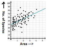
In the above graph, dots represent the relationship between two variables. It is not possible to draw a straight line based on the given data. However, by using logarithmic calculations, a straight line can be drawn to find the regression coefficient. In the case of the species-area relationship, the graph actually forms a hyperbola, which cannot be used for calculating the regression coefficient.
Nevertheless, a logarithmic calculation can provide a straight line, and based on the graph, the regression coefficient can be calculated. It is important to note that only the straight line can yield the values of C and Z.
Z, as a regression coefficient, also represents the slope of the line on the graph. This slope indicates the rate at which the number of species increases as the area expands. To gain a deeper understanding, let’s clarify the concept of slope using a simple graph shown below:
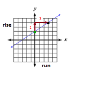
What does it mean? In a simple language, it means that if you spend 3 hours of study every day, your score will increase by 2%. Likewise, we can also calculate the value of Z by finding the slope of the curve.
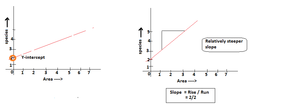
In the above graph, it is seen that the slope of the left graph is 2/3 and the slope of the right side graph is 2/2. The graph on the right side is much steeper (more inclined towards Y axis) compared to the left side graph. By analyzing the graph, we can clearly see that steeper the curve, higher is the slope value.
The left side graph states that with increase in 5 meter area, there is a 2% increase in species richness. On the other hand, the right side graph states that with increase in 2 meter area, there is a 2% increase in the species richness. It means, steeper the curve (in small area), higher would be the percentage of species richness.
Scientists have discovered that the value of Z lies in between 0.1 and 0.2 regarless of the taxonomic group or the region. For instance, plants in Britain, birds in Califormia or mollusks in New York — the slope of regression line are similar.
It is important to note that the species area relationship among large areas like the entire continents — the slope of the line become steeper and Z value comes in the range of 0.6 to 1.2. For instance the fruit eating birds and mammals in the tropical forests of different continents, the slope is found to be 1.15. The steeper line means, the line is more inclined towards the Y-axis.
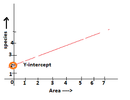
Let’s now discuss the meaning of the constant C. It says that C is the intercept of the species when the area A is very small (A=0). What it means? It simply means that C is a point on the Y-axis that represents the number of species that one can expect in the tiniest possible area. For example, even in a tiniest garden, you will find some species.
Conclusion
This study offers us profound insights into biodiversity conservation and ecosystem management, unlocking secrets that can make a real difference in protecting our planet’s precious life forms.
So, what’s the big deal with the species-area relationship? Well, by delving into this fascinating field, scientists can estimate the number of species thriving in a specific geographical area. Just imagine the possibilities! Armed with this valuable information, scientists and conservationists can prioritize their efforts and identify areas of exceptional conservation value.
Think of it like creating a treasure map! As we study the species-area relationship, we’re uncovering clues about the amazing biodiversity hidden within various regions. Armed with these clues, we can map out strategies to safeguard these unique ecosystems and the incredible species that call them home.
So, let’s embark on this thrilling journey of discovery together! Biodiversity conservation is our mission, and with the species-area relationship as our compass, we’re all set to make a positive impact on the world around us. Feel free to ask questions, share your thoughts, and let’s explore the wonders of science and conservation hand in hand!
